Saturday, 1 February 2014

Lotions& Potions : Concept development

Colour:


I have decided to go for a bright positive colour scheme as I feel that it will aid in the contemporary warm feel of the shop. 


Logo:

The logo has been derived from the witches images that I originally first looked at the line going through the cauldron is the symbol of the stirrer for the lotions and potions. 


Spells:

For the shop promotional good I have decided to cre- ate poem like spells after I discovered some spells online I think it could work really well with the recipe book or as posters. 


Lotions & potions : Reserarch

DIY research:


 DIY:


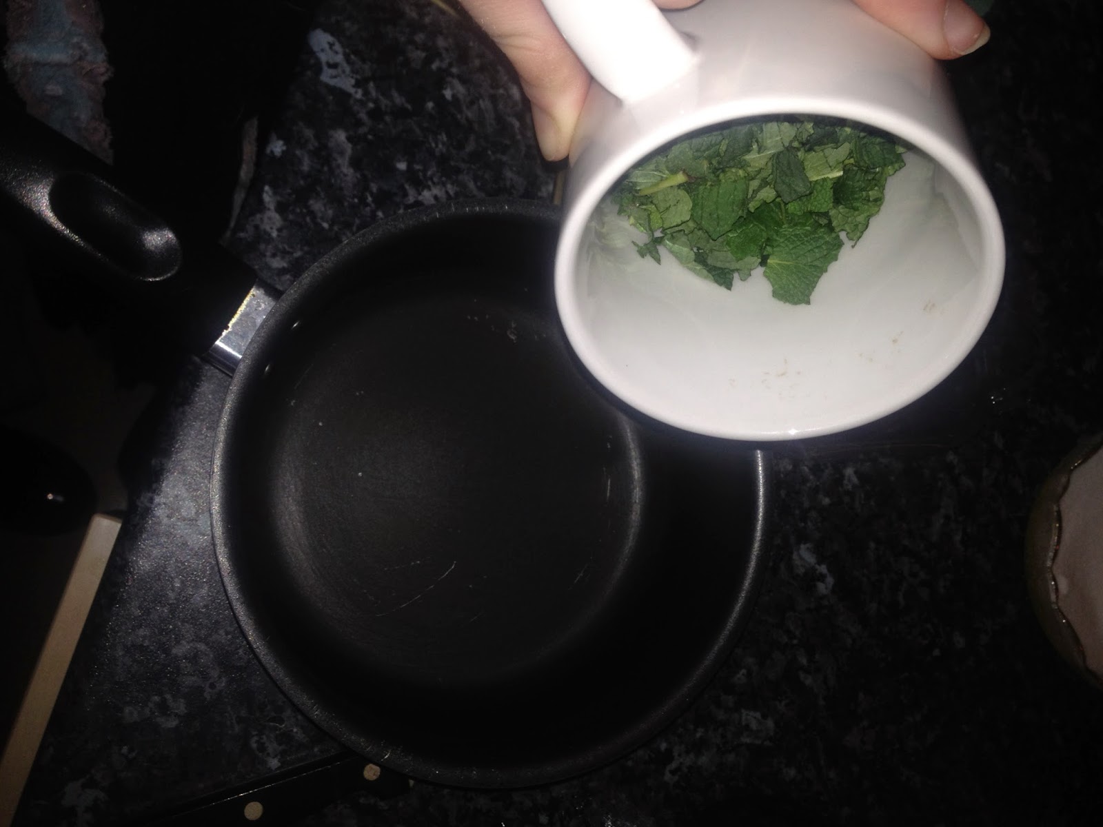
Lotions & Potions is all about creating DIY fresh fruits and veg beauty products in front of the customer. For some primary research I decided to try out one of the potions, a mint and raspberry toner. It was easy and quick to make and was a nice skin product which is a positive example of an all natural beauty product 

1,


2,


3,


Paper:

After researching into paper making and trying out the raspberry and mint toner I decided to try and make some paper out of the left over raspberry and mint that would have otherwise gone in the bin. I really like the effect that came through on the paper and I also enjoy that the paper works with the concept of every things fresh that paper will now act like fruit. 


Beauty products:

I have been looking a variety of beauty packaging ranging from boutique expnsive to low budget. The design that I personally think has worked the best is the simple but effective packing which is something I will take forward into my own designs for Lotions & Potions. 


Tuesday, 28 January 2014

Lotions & Potions : Concept

Witches :


As the shops is called lotions and potions which is derived from the idea of witches mixing up magic potions I decided to do some research into imagery of witches as a source for logo inspiration. Out of the imagery that witches conjure up I think the cauldron would work well as a logo starter for Lotion & Potions as the cauldron is where witches mix their potions. 

Paper :


 I have been researching into hand made paper making as I think the aesthetics of hand made paper is always really nice. I also like the fact that it is hand made just like the lotions & Potions are all hand made. The quality of these two items would go well together as it fits the DIY ethos of Lotions & Potions. 

Bottles:


Another aspect of DIY ethos that I think would work really well in the shop is the concept of bring your own container in the above show in London you bring and fill your own container and then pay. I think this concept would work nicely with Lotion & Potions as it would match the withy feel having odd potion bottles. 

Plan:

develop concept
research visuals / concept 
design

Monday, 27 January 2014

Lotions&Potions : Audience / Context

Audience:


As this is a shop that is for beauty products the audi- ence will be predominately female, ages between 18 -35. She would be a person who like to take care of her skin and is in to natural skin care products. She may be someone who has a busy lifestyle and cant afford the time to make beauty product herself so comes to Lotions & Potions. 

Context:


The context for this brief would be a shop that has a warm and friendly feel. It would have more of a cafe feel than a beauty store as it stocks only fresh fruit as a product.

 For some primary research I had a look around some beauty shops in Leeds and a lot of them had a horrid sterile clean feel to them, except for L’ooctane which had a warm, friendly and real feel to it. 

Lotions&Potions : Initial Brief

Brief

Design the identity, branding and promotion for DIY all natural beauty shop Lotions & Potions. Lotions & Potions creates the beauty product in front of you, you order as if you were placing an order in a cafe and they will mix up a fresh fruit beauty potion just for you. This is one way of guaranteeing that you are not using any nasty chemicals in your beauty regime and you know exactly where and what is in your product.

This is a beauty shop that I myself would want to visit as DIY facial masks are easy but time consuming so Lotion & potions acts as that spring board speeding up the process of using all natura all freshl diy beauty product.


This is a skin care product with the concept of all natural everything in that shop is fresh. The purpose of this briefs is the design and brand the shop as if it was going to open