Final images :
The book cover is simple, with a use of strong
contrasting black and white. From research most travel
guides are very garish in colour, so I think by doing
something sleek and black and white it will stand out.
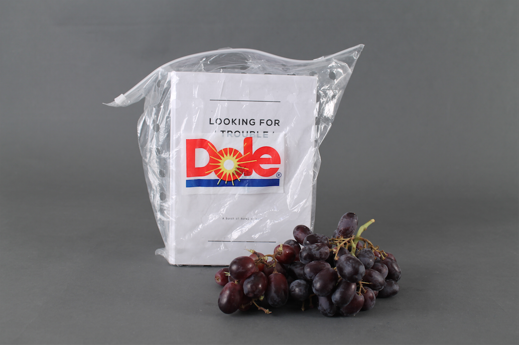
The book also come packed in a plastic grape big to
complement the concept that the book is a bunch of
gripes.
I wanted to keep all the information about each hotel very short but with all the essential
information you need about the hotel. Often you
have to read through chunks of text to find out
the essentials which are most of the time pretty
basic, but you have to search for them within
the text which takes time.
This is where the comments on trip advisor will come
into full swing. The comment I have picked out are the
ones which you read and think, why on earth would
they right that! and stir up some sort of emotion within
you. To make sure that the comments are not read as a negative reflection to the hotel I have paired up each
comment with an image that reflects the pettiness of
the trip advisor comment.


No comments:
Post a Comment