Thursday, 27 February 2014

TRM : Research development

The pressure


Whislt meandering the internet I cam across this video of cd packaging and it made me realise that this sort of packaging would be perfect to work as Toms mailer as it can be flat and by being flat it wont end up as dog eared. I will develop this packaging for Tom.

Image zoom:


I am going to code and create Tom's website as I want to start screen printing and doing all of his promotional stuff but i can't until i have done his website. I am going to keep the website simple and just showcase images of his work but use image zoom so that if someone is to roll over the image it will zoom in on it and allow the person to see the close up detail that they may have missed.


Wednesday, 26 February 2014

OUGD603 : Brain tutorial

Brief 4 : T.R.M

Brain offered some advice on the TRM project . I said I felt it was a little too over powering and so we spoke about ways in which this could be altered and then came up with the conclusion that the mailer could just feature one strip of toms illustrations instead of having each edge of the box covered. I will experiment with the box as after the crhistmas submition it got very squashed which shows that it would not made a very good mail out as it is not durable enough.

Old book new :

Develop further, possibly use gentler colours and more fitting typeface

Monday, 24 February 2014

Adopt A Band : Online presence

A main part of Adopt a band is communication. The website is very basic with only the vital information on. The main ports of call for bands would be Facebook, Twitter and email. This way it means that people have to engage with us and build relationships to find out information which will give both us and the band and chance to know wether we want to work together 

Facebook:


Twitter:


Mail:

Thursday, 20 February 2014

Tamarriol : Trouble

Tamarillo:

This project has had to be paused because of a number reasons to do with the band one being that one of the band mates has left leaving jut one person Troy. And the second more tragic reason that the hard rive containing all the music has broken and can't be fixed so troy is starting agin with the music that will take months.

This means that for now this project has come to an end. When troy has the music we will pick this up again but until then we shall wait

Wednesday, 19 February 2014

Adopt A Band : Website

Below are some stills from the website. The website is very simplistic and easy to use. It only houses the basic but importan information as we don't want to over power people/give people a chance to dismiss this as something they are not interested in. We want to communicate with people so we want people to get I touch to find out more information 


Sunday, 16 February 2014

Year book : research into yearbooks

Old yearbooks:

We have been looking at old year books to see what each one includes and how they represent the students. We also looked at past year books for inter which was handy to see what they have had done before. We now have a better understanding of what we feel works in the year book and what doesn't. From looking at the books it has reinstated the fact that it is very importantes to represent the year group and make the year book about them and for them.


Saturday, 15 February 2014

Year Book : pitches

Below are the previous pitches that we have made for they year book. I have written in more detail about the pitches on my PPP blog but will briefly explain now. To gain the opportunity to do a year book you had to pitched firstly for the graphic design year book. We interoperated this wrongly and as we did not want to do the Graphic design year book we developed a concept for printed textiles, but this however was wrong. We were very happy with our concept for printed textiles and felt that it would have been a great opportunity to showcase the courses work in a more unique way rather than the usual rectangles space to showcase the work. But this was our error so we had to let go of this concept. We then got the chance to re pitch for graphic design, so this time we derives a concept specifically for the graphic design course which can be seen as pitch two. This then lead on to us being given the year book for interdisciplinary art and design which is a course I didn't know much about at the time but has since developed an understanding about it. We then upon advise from tutors developed a concept before meeting the course for the year book to give to interdiplinary, I can no longer locate the presentation boards but it was a concept based upon commemorating and celebrating this end of their chapter  as they begin a new section of life. We thought it would be playful and positive to represent this through the concept of  'Sorry you are leaving' and making the year book into a retirement party theme as they are retiring from education and taking the next step. This concept was not taken very lightly from inter and we soon realised after meeting the group that we got the tone of this year book completely wrong which is not surprising as we had developed the concept before meeting anyone from the course. We were then given their concept of 'co-ordinates' and that is the theme we are now working to for the year book.


Pitch One :


Pitch Two:


Pitch Three :

'Sorry you are leaving'

Friday, 14 February 2014

Yearbook : Audience / context


Audience:

The audience for the year book will be predominantly the students and their families. Normally the audience would stretch to perspective students, but as this course is coming to an end it means that this is not the case for this year book. The audience will also be viewers of the end of year show and potential clients who may be interested in the students work. 

Context: 


The year book will be available to pick up through out the end of year show. It will also be available to all students on the course to take as a way of commemorating their time on the course. It would also work as a gift that could be given to relatives of people on the course so they can also celebrate their loved one graduating. 

Through thinking about the context of this year book we realised that the sole importance of this year book is to celebrate, commemorate and showcase the students. There is no secondary purpose to advertise the course to perspective students as this is no longer a course that is available. Picking up on these factors we really want to make this year book a celebration of this year group and the work they do / what they have achieved we want to work closely with them and give them something that they want and that truly represents them.

Year book : initial brief


Brief:

Create the year book for Leeds college of Art BA(hons) course Interdisciplinary (art and design). The year book will include examples of all the graduating students from that course, and will also include information about the course itself from the lead tutor. 

The purpose of the year book is to showcase the students in a positive reflection that shows off the hard work that they have put in during their time at Leeds College of Art. It will act as a way of promoting the students and their work to potential clients / buyers of their work, and also as a way of celebrating them as a year group.

This brief will be a collaboration between myself, Lizzi, Mike and Greta. We pitched for this brief initially as just myself, Lizzi and Greta but after talking with Mike we decided that this would be a great opportunity to work together and as this is a brief that will undertake a lot of work and time we felt having the four of us together with our skill set will work well. 

Wednesday, 12 February 2014

Adopt A band : flyer development

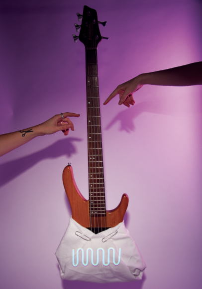
Myself and Greta both agreed that we were not happy with the previous flyer something about it didn't feel right. It was not ohotogrpahed very well and the use of the acoutaic guitar gave a strange visual. We decided to re shoot the flyer but this time using better lighting and a bass guitar which may seem a bit more 'cool' than an acoustic. 


The photgraphs came out a lot better and we evolved the shoot into using our hands too as we feel that hands represent the caring side to the concept of adopt a band 


This is the end visual for the flyer it holds a lot more personality and is more striking through the colour and the fact it has been shot well. We both now feel comfortable to make this into a flyer and to hand it out.

Tuesday, 11 February 2014

Lotions & Potions : design development

Logo:

This is the development for the logo. I have centred the logo around the witchy concept of the mixing Calderon as mixing is a big part of the concept of the shop mixing up potions.


This is the logo I have created for lotions and potions. I feel this logo speaks the concept the clearest and is visual pleasing.


Recipe Book :
As the shop is all about DIY beauty remedies it seems very fitting to create a recipe book for all the DIY recipes for beauty. The book would include the recipes and continue the witchy feel by including the witches spell style poems.


I have photgraphed the fruit for each recipe as I feel this is a very clear way of showing exactly what the ingredients are to each recipe. 

When thinking about the logistics of a recipe book I realised often they are at risk of getting very messy so I have decided to use the image of the ingredients as a protector over the actual recipe 


Tag:

The tag will feature the logo stamped on the front and on the back I have decided to leave it blank and the person who is mixing the potion would fill it In This way it makes the tag a bit more personable for the customer.


Menu:


 All:

To make sure that things in the range are fitting together I have created a large document to look at visually to see if things are working in unison which I belive they .